
Customize colors and forms of a radar chart in an excel report
There are many chart options in excel but one day, I had to use the radar one and excel proposes 3 options: the simple one, the radar with markers and the filled radar. The most inconvenient, for me, is the color, particularly when I used the filled radar because it will fill up and merge automatically the same color for my different values.
It doesn’t mean that there is not a way to personalize the form and the color for each value but I have to trick excel. In fact, I started first to look in internet if someone had the same issue like me, more importantly, if the chart I wanted, someone had done it already. Unfortunately, no one or at least, I didn’t find anything but based on what I read, at the end, and with a little guess, I found how to do it.
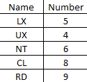
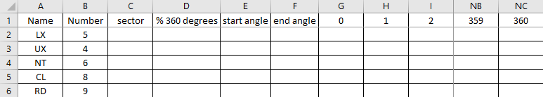
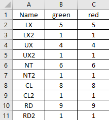
To explain better, I will use those data:
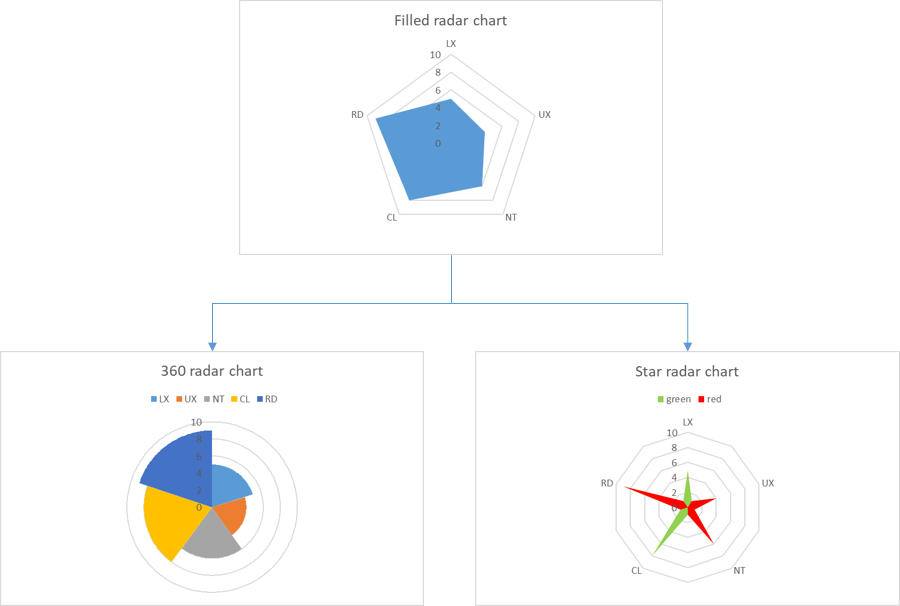
So if I select the filled radar, excel will display the chart:
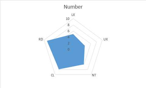
All names have the same color, and with the different configuration options, there is no way to put different colors for LX, UX, NT, CL and RD. To do that, I will describe 2 options that I use the most, the 360 radar chart (it can be found in internet) and the star radar chart (my own creation).
The 360 radar chart
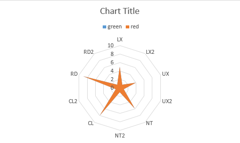
It is to represent it in 360 degrees, in fact, each name will take 1 portion of the 360 degrees so excel will show a different color for each name. First, I have to extend the table like this from the column A to NC; just take note that from the column G to NC, I put 0, 1, 2, 3, 4, etc. until 360:
 |
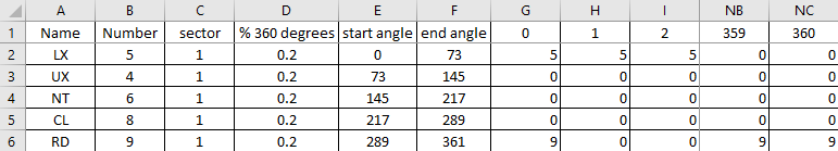 |
- In the “sector” column, put 1 for all cells
- In the “% 360 degrees” column, in the cell D2, put this formula then copy it to the below cells: =C2/SUM($C$2:$C$6)
- In the “start angle” column:
o In the cell E2, put 0
o In the cell E3, put =F2 (referencing to the second cell of the “end angle” column) then copy it to the below cells - In the “end angle” column, in the cell F2, put this formula then copy it to the below cells: =360*SUM($D$2:D2)+1
- In the “0” column:
o In the cell G2, put this formula then copy it to the below cells: =IF(AND(G$1>=$E2,G$1<=$F2),$B2,0)
o Then select all cells except G1 of this column, copy them and paste them to all empty cells until the last column which is the “360” column
o In the cell G6, put =NC6 (referencing to the last cell of the “360” column)
Once all cells are filled, select the data as shown below then create the filled radar.
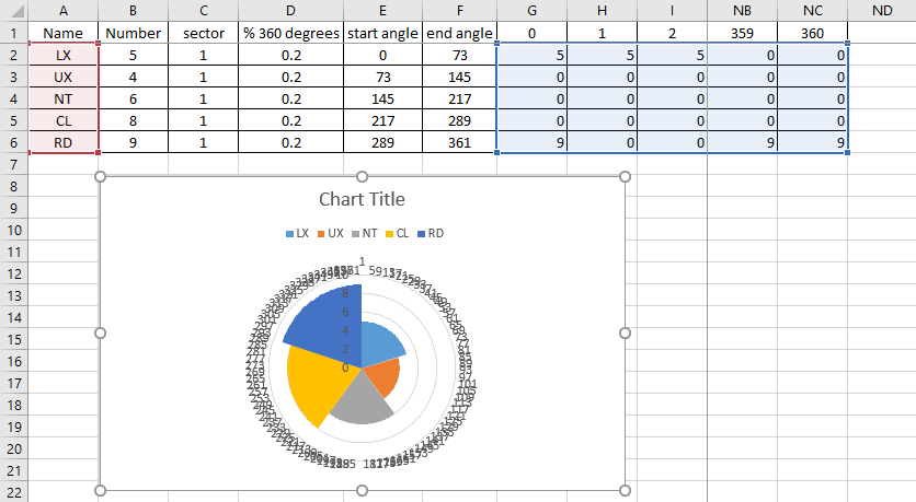
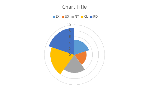
To delete the annoying numbers in circle, just click anywhere in the “circle” then delete it so the chart will display like this:
The star radar chart
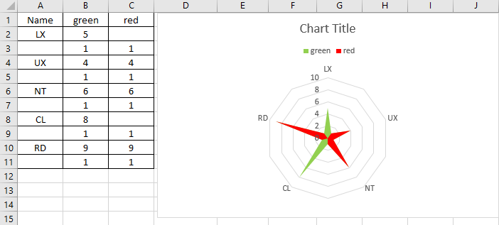
For this chart, I need to duplicate each name and to reference the column with a color. I can put many colors I want but for this example, I will just take 2 colors. My table will look like this:
And I will create the filled radar chart and now I will:
- In the chart, change the blue color to green (just select the “green” legend then right click to select “format legend entry”) and the orange one to red
- In the table, delete the duplicate names so in the chart, the duplicate ones will not appear
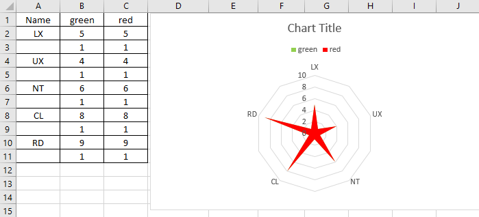
Imagine that I want to have LX and CL in green and the rest in red, from the table, I will delete the number in red for LX and CL:
Interesting Management
-

Part 1: A good manager, better team motivation, better team productivity, better team results
When you are managing a team, “how to be a good manager” is the “must”...
-

Report optimization, increase your time management
As manager, I am doing many reports, even when I was an ITIL consultant, I still needed to do many reports...
-

Tools to get your ITIL intermediate certifications, the missing 15 points for the ITIL 4 Managing Professional
ITIL V3 is going to be obsolete...
-

The importance of the first customer meeting for the service
Managing an IT service when I start a new company is not an easy task, particularly true, if the service...
-

1 click macro tool: Incident/Problem Management - create a daily report in excel
This file will allow you to have in one single excel file the issues (incidents, problems, outages, major incidents...
-
1 click macro tool: Incident/Problem Management - create a daily report and a public version in excel
This file is an extended version of the above that includes the option to create a public version to share with...
-
1 click macro tool: Problem/Incident Management - compile multiple daily excel files in 1 with access
This file will allow you to compile all daily issues reported in excel in 1 single excel file in xlsx format...
-
1 click macro tool: Incident/Problem Management - create a monthly report in excel
This file will allow you to create a monthly report related to daily issues and updating all pivots, charts and...
-
1 click macro tool: Problem/Incident Management - create daily reports and compile them in 1 to create the monthly report in excel
This tool will create daily reports then compile them to create the monthly...
-

Calculate a weighted average for a SLA and a conversation time with a formula in an excel report
In one of my experiences, I had a tool that gave me the weighted average...
-
Search in different sheets then display the wanted data with a formula in an excel report
vlookup and hlookup are formulas that allow to search a data in another...
-
Find the good data by matching 3 different criterias with a formula in an excel report
It is a combination of “index” and “match” formulas, much better...
-
Sum and count sales with a formula in an excel report
Extracting data from salesforce or qlikview may not give the information I needed, it already happened...
-
Know how long a service is impacted with a formula in an excel report
It is important to know how long the service has been impacted by...