
Power BI: stacked and clustered column chart or double stacked column chart
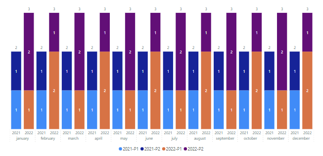
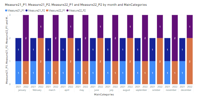
In excel, I use a lot the combination of clustered and stacked chart to make comparison, for instance, between 2 different years. In Power BI, there is the simplest way and the simple way (only from Power BI version 2.110.1161.0, if you have an old version, upgrade it). The simplest way, it is to have all data in one single table and the simple way, it is to have the data in 2 tables, one for each year. At the end, what I want it is this result.
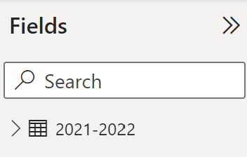
Before to begin, take note that what I am going to explain, it is more for charts with lines because the ones without, Power BI can manage them correctly without this method. Saying that, let´s start by the simplest way, I have my years in 1 table like that:
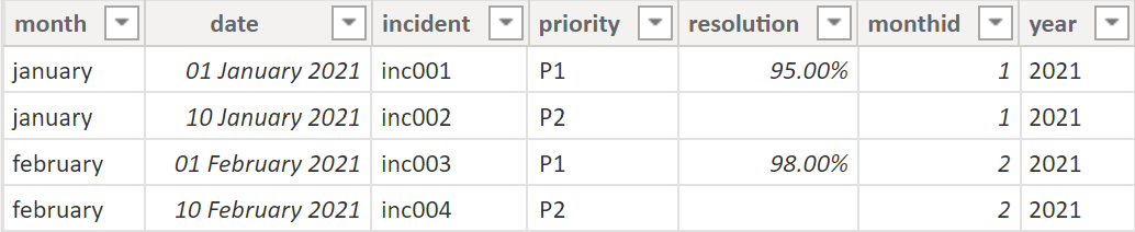
And my data looks like that, from January 2021 until December 2022:
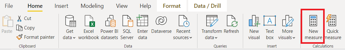
First, I have to create 2 measures, one to count P1 and the other for P2 by clicking on “new measure”:
Then put this formula:
CALCULATE(XX('table'[argument1]),'table'[argument2]="YY") //XX change to your function and YY to your value

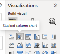
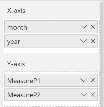
And I will change its name from “measure” to “measureP1” and “measureP2”. Now that all ingredients are here, I will create my chart by selecting “stacked column chart” and in the “x and y axis” I will put those criterias:
 |
 |
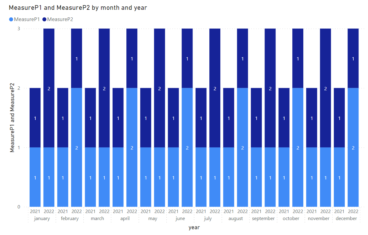
Once done, here my chart:
If I want to add the “resolution”, same thing, I will need to create 2 other measures using the same formula as above:

Then change the chart to “line and stacked column chart” and in the “line y-axis”, put those new measures.
Before to start to explain the other way, first I would like to make reference to this article “How to combine a clustered and stacked chart in Power BI” that I used to adapt to my needs. The most important point is that you understand the principle because once done, the concept can be applied to your needs, here I am showing 2 columns but it can be 3, 4, etc.
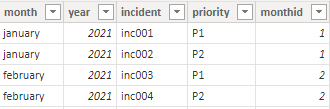
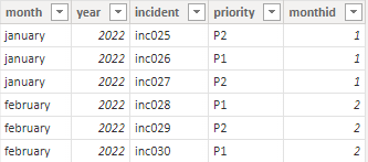
Let´s begin, I have those 2 tables, one for 2021 and one for 2022, the other months are similars:
 |
 |
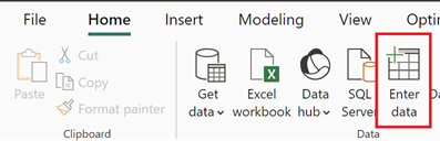
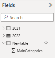
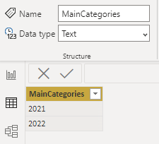
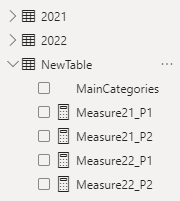
I will create first a new table and there is no need to create a relationship, the only relationship I have it is between my tables “2021” and “2022”. This new table will contain only 1 column in which I will reference the main categories to create the 2 columns by clicking on “home -> enter data”.
By default, Power BI will consider them as “whole number”, it is important to have them as “text” so I will select the column and in “data type”, I will change it into “text”.
 |
 |
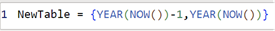
NOTE: if I want my years to be updated automatically, I will create the “newtable” by clicking on “modeling -> new table” instead of “home -> enter data”:
And by using this formula:
- {YEAR(NOW())-1,YEAR(NOW())}
I will rename my column to “years” and I will add 2 new columns with those formula:
- Last year: YEAR(NOW())-1
- Current year: YEAR(NOW())
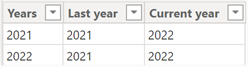
And for those 3 columns, I will change them into “text”.
Still with my new table, I will create 4 measures because what I want to show it is the number of incidents per month but displaying the priority per year. In my example, I have only 2 priorities per year but as most of you know, in IT, priorities go to P5 meaning that if I have 5 priorities, I will create 10 measures with this formula:
SUMX('table', //SUMX don’t modify, 'table' put your new table
VAR XX = 'table'[argument] //XX put whatever you want, 'table'[argument] put your new table
Return
IF(
XX="YY", //YY put your category
FF //FF put your formula
))
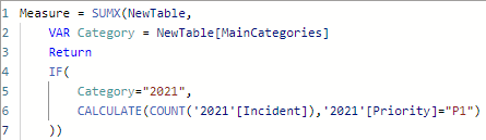
Read the comments to adapt to your needs. I will repeat this 3 more times:
- 1 more for 2021 for P2
- Duplicating them for 2022
And I will change the name of the measures:
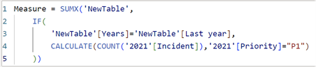
NOTE: for the automatic years, the formula will be:
SUMX('table', //SUMX don’t modify, table put yours
IF(
'table'[argument1]='table'[argument2], //argument put yours
FF //FF put your formula
))
Now that all are set up, the easier part is coming. I will create my chart and put those criterias:
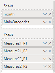
Once done, here my chart:
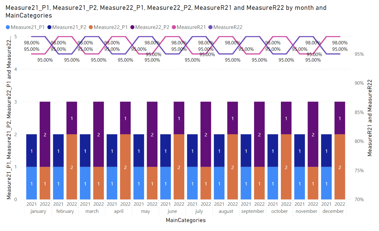
If I want to add the “resolution”, I will need to create 2 other measures with this formula, one for 2021 and one for 2022 (not for the new table):
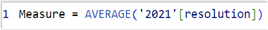
- AVERAGE('table'[argument])
Then change the chart to “line and stacked column chart” and in the “line y-axis”, put those new measures.
Interesting Management
-

Part 1: A good manager, better team motivation, better team productivity, better team results
When you are managing a team, “how to be a good manager” is the “must”...
-

Report optimization, increase your time management
As manager, I am doing many reports, even when I was an ITIL consultant, I still needed to do many reports...
-

Tools to get your ITIL intermediate certifications, the missing 15 points for the ITIL 4 Managing Professional
ITIL V3 is going to be obsolete...
-

The importance of the first customer meeting for the service
Managing an IT service when I start a new company is not an easy task, particularly true, if the service...
-

1 click macro tool: Incident/Problem Management - create a daily report in excel
This file will allow you to have in one single excel file the issues (incidents, problems, outages, major incidents...
-
1 click macro tool: Incident/Problem Management - create a daily report and a public version in excel
This file is an extended version of the above that includes the option to create a public version to share with...
-
1 click macro tool: Problem/Incident Management - compile multiple daily excel files in 1 with access
This file will allow you to compile all daily issues reported in excel in 1 single excel file in xlsx format...
-
1 click macro tool: Incident/Problem Management - create a monthly report in excel
This file will allow you to create a monthly report related to daily issues and updating all pivots, charts and...
-
1 click macro tool: Problem/Incident Management - create daily reports and compile them in 1 to create the monthly report in excel
This tool will create daily reports then compile them to create the monthly...
-

Calculate a weighted average for a SLA and a conversation time with a formula in an excel report
In one of my experiences, I had a tool that gave me the weighted average...
-
Search in different sheets then display the wanted data with a formula in an excel report
vlookup and hlookup are formulas that allow to search a data in another...
-
Find the good data by matching 3 different criterias with a formula in an excel report
It is a combination of “index” and “match” formulas, much better...
-
Sum and count sales with a formula in an excel report
Extracting data from salesforce or qlikview may not give the information I needed, it already happened...
-
Know how long a service is impacted with a formula in an excel report
It is important to know how long the service has been impacted by...