

Power BI: create a monthly chart of a measure with 2 criteria
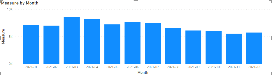
It is quite simple to create a monthly chart when my measure has a simple calculation but if my measure has 2 criteria to calculate the value, the chart is not displaying correctly. To do so, I have to add a monthly filter in my calculation. Let’s take an example. I have this simple measure:
COUNT('table'[argument])

Creating the monthly chart, it will look like that:
Now I have this measure with 2 conditions:
COUNTROWS(FILTER(ALLSELECTED('table'),'table'[argument1]="xxx" && 'table'[argument2]="xxx"))

Using the same chart, I will replace in the “values” field, “measure” by “measure 2”, and I get this:
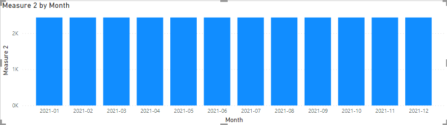
Every month, the value is the same, of course, it may happen but in my example, it should not. The way to remediate, it is to add a monthly filter in my calculation for my “measure 2”:
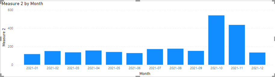
CALCULATE(COUNTROWS(FILTER(ALLSELECTED('table'),'table'[argument1]="xxx" && 'table'[argument]="xxx2")),FILTER(ALLSELECTED('table'),'table'[argument3]=MAX('table'[argument3])))

And now, the chart is showing correctly.
Interesting Management
-

Part 1: A good manager, better team motivation, better team productivity, better team results
When you are managing a team, “how to be a good manager” is the “must”...
-

Report optimization, increase your time management
As manager, I am doing many reports, even when I was an ITIL consultant, I still needed to do many reports...
-

Tools to get your ITIL intermediate certifications, the missing 15 points for the ITIL 4 Managing Professional
ITIL V3 is going to be obsolete...
-

The importance of the first customer meeting for the service
Managing an IT service when I start a new company is not an easy task, particularly true, if the service...
-

1 click macro tool: Incident/Problem Management - create a daily report in excel
This file will allow you to have in one single excel file the issues (incidents, problems, outages, major incidents...
-
1 click macro tool: Incident/Problem Management - create a daily report and a public version in excel
This file is an extended version of the above that includes the option to create a public version to share with...
-
1 click macro tool: Problem/Incident Management - compile multiple daily excel files in 1 with access
This file will allow you to compile all daily issues reported in excel in 1 single excel file in xlsx format...
-
1 click macro tool: Incident/Problem Management - create a monthly report in excel
This file will allow you to create a monthly report related to daily issues and updating all pivots, charts and...
-
1 click macro tool: Problem/Incident Management - create daily reports and compile them in 1 to create the monthly report in excel
This tool will create daily reports then compile them to create the monthly...
-

Calculate a weighted average for a SLA and a conversation time with a formula in an excel report
In one of my experiences, I had a tool that gave me the weighted average...
-
Search in different sheets then display the wanted data with a formula in an excel report
vlookup and hlookup are formulas that allow to search a data in another...
-
Find the good data by matching 3 different criterias with a formula in an excel report
It is a combination of “index” and “match” formulas, much better...
-
Sum and count sales with a formula in an excel report
Extracting data from salesforce or qlikview may not give the information I needed, it already happened...
-
Know how long a service is impacted with a formula in an excel report
It is important to know how long the service has been impacted by...