

ServiceNow: add reports/charts in the homepage
The homepage doesn’t allow me to organize a good way my reports/charts, all are put together, I can change the layout and move them but I can’t group them in an efficiency way. If what I want it is a better way to manage, I have to put them into a dashboard, read ServiceNow: add reports/charts in the dashboard. To add a report or a chart in the homepage, follow those steps:
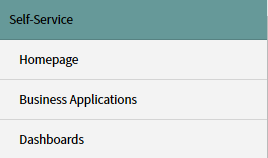
- 1. Go to “self-service -> homepage”
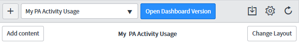
- 2. Click to “add content”
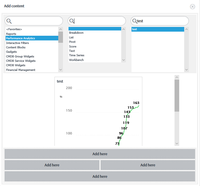
a. Choose from the list or put a name
b. Once find it, click to “add here”
- 3. The chart/report will display in the homepage
I can refresh the full homepage or just refresh 1 chart/report. For the homepage, there are 4 options displaying on the top right (just move the mouse to the title):
- To export
- To change settings
- To refresh
- To change layout.
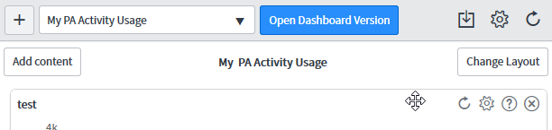
Now if I want to refresh or to edit only 1 single report/chart, I have to move my mouse to the top right of the title area of my chart/report to get those options:
- To refresh
- To edit preferences
- To get more information
- To remove
As said above, I can move the charts/reports, for instance, putting the important ones at the top and the less important ones at the bottom.
Interesting Management
-

Part 1: A good manager, better team motivation, better team productivity, better team results
When you are managing a team, “how to be a good manager” is the “must”...
-

Report optimization, increase your time management
As manager, I am doing many reports, even when I was an ITIL consultant, I still needed to do many reports...
-

Tools to get your ITIL intermediate certifications, the missing 15 points for the ITIL 4 Managing Professional
ITIL V3 is going to be obsolete...
-

The importance of the first customer meeting for the service
Managing an IT service when I start a new company is not an easy task, particularly true, if the service...
-

1 click macro tool: Incident/Problem Management - create a daily report in excel
This file will allow you to have in one single excel file the issues (incidents, problems, outages, major incidents...
-
1 click macro tool: Incident/Problem Management - create a daily report and a public version in excel
This file is an extended version of the above that includes the option to create a public version to share with...
-
1 click macro tool: Problem/Incident Management - compile multiple daily excel files in 1 with access
This file will allow you to compile all daily issues reported in excel in 1 single excel file in xlsx format...
-
1 click macro tool: Incident/Problem Management - create a monthly report in excel
This file will allow you to create a monthly report related to daily issues and updating all pivots, charts and...
-
1 click macro tool: Problem/Incident Management - create daily reports and compile them in 1 to create the monthly report in excel
This tool will create daily reports then compile them to create the monthly...
-

Calculate a weighted average for a SLA and a conversation time with a formula in an excel report
In one of my experiences, I had a tool that gave me the weighted average...
-
Search in different sheets then display the wanted data with a formula in an excel report
vlookup and hlookup are formulas that allow to search a data in another...
-
Find the good data by matching 3 different criterias with a formula in an excel report
It is a combination of “index” and “match” formulas, much better...
-
Sum and count sales with a formula in an excel report
Extracting data from salesforce or qlikview may not give the information I needed, it already happened...
-
Know how long a service is impacted with a formula in an excel report
It is important to know how long the service has been impacted by...