

Create a bar/pie of pie chart for an excel report
This graph is very useful when I need to show side by side the total product and the sub-total of a particular product. It allows me to emphasize one aspect of my report so telling to my customer to focus particularly in this section.
I remember that when I did it the first time, it was not easy to understand, even looking into internet, I couldn’t find the right explanation and at the end, by guessing and testing, I found out the how to.
 |
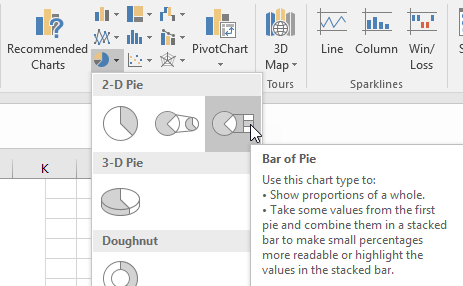 |
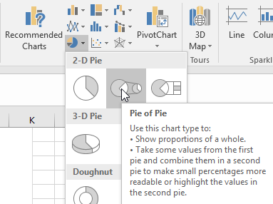
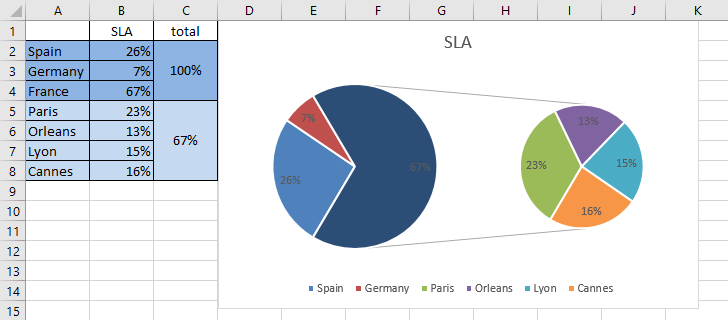
I will explain the pie of pie graph because the bar of pie chart works the same way. Imagine that I have those data:
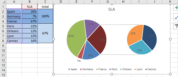
And I want to show on the left side, the countries and on the right side, the French cities so if I am selecting all data of the column A and B, I got the chart above.
As you can see, the “France” data is showing twice and it is something that I don’t want. By selecting the same data but without the row 4 (the France one), I got almost the correct chart but at least, France is not duplicate anymore.
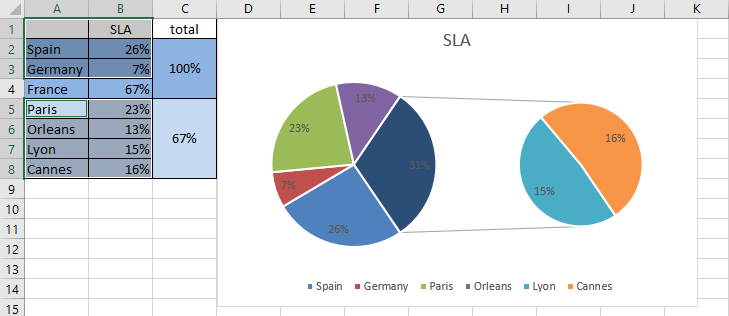
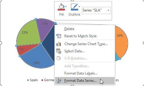
To have all the cities on the right side, I have to right click on the pie and select the “format data series” option:
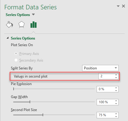
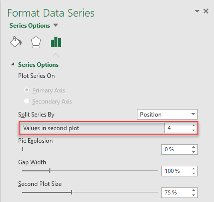
I will get this panel and on the “values in second plot” field, I will put “4”:
 |
 |
Automatically, the chart will be updated and now, I have the correct graph:
As you can see, it is not complicated but may be I am not smart enough to understand quickly how to create this kind of charts :-)
Interesting Management
-

Part 1: A good manager, better team motivation, better team productivity, better team results
When you are managing a team, “how to be a good manager” is the “must”...
-

Report optimization, increase your time management
As manager, I am doing many reports, even when I was an ITIL consultant, I still needed to do many reports...
-

Tools to get your ITIL intermediate certifications, the missing 15 points for the ITIL 4 Managing Professional
ITIL V3 is going to be obsolete...
-

The importance of the first customer meeting for the service
Managing an IT service when I start a new company is not an easy task, particularly true, if the service...
-

1 click macro tool: Incident/Problem Management - create a daily report in excel
This file will allow you to have in one single excel file the issues (incidents, problems, outages, major incidents...
-
1 click macro tool: Incident/Problem Management - create a daily report and a public version in excel
This file is an extended version of the above that includes the option to create a public version to share with...
-
1 click macro tool: Problem/Incident Management - compile multiple daily excel files in 1 with access
This file will allow you to compile all daily issues reported in excel in 1 single excel file in xlsx format...
-
1 click macro tool: Incident/Problem Management - create a monthly report in excel
This file will allow you to create a monthly report related to daily issues and updating all pivots, charts and...
-
1 click macro tool: Problem/Incident Management - create daily reports and compile them in 1 to create the monthly report in excel
This tool will create daily reports then compile them to create the monthly...
-

Calculate a weighted average for a SLA and a conversation time with a formula in an excel report
In one of my experiences, I had a tool that gave me the weighted average...
-
Search in different sheets then display the wanted data with a formula in an excel report
vlookup and hlookup are formulas that allow to search a data in another...
-
Find the good data by matching 3 different criterias with a formula in an excel report
It is a combination of “index” and “match” formulas, much better...
-
Sum and count sales with a formula in an excel report
Extracting data from salesforce or qlikview may not give the information I needed, it already happened...
-
Know how long a service is impacted with a formula in an excel report
It is important to know how long the service has been impacted by...