

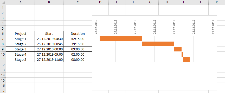
Create a project chart for an excel report
Microsoft Project is a better tool than excel to create a project but in some companies, I don’t have this tool so as a workaround, I created something similar in excel to follow up the project from the initiation until the completion. In fact, it is just a chart showing the progress of each stage of a project.
Following the steps:
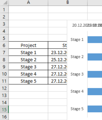
- 1. Creating the chart by selecting the data
a. Click “insert -> stacked bar”
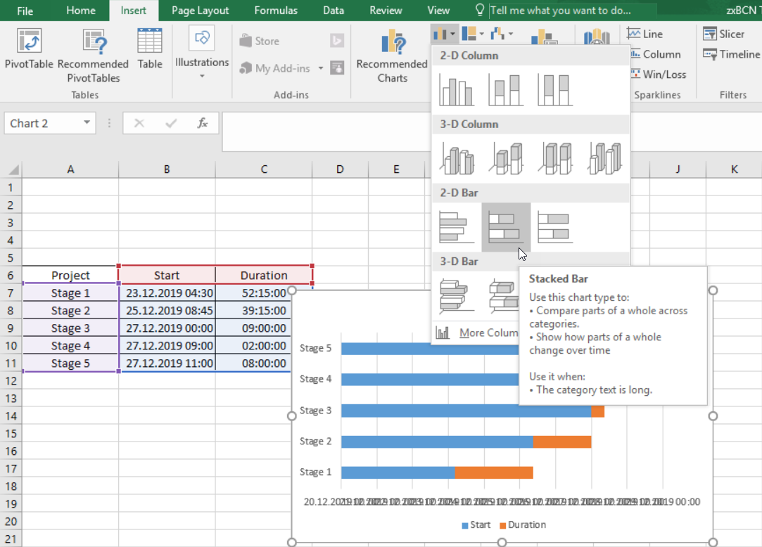
- 2. In the chart
a. Delete legends and chart title
b. Making the “comment” section similar to the “project” column
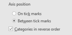
- i. In the chart, select the comment section then right click to select “format axis”
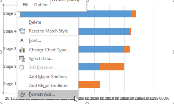
1. Select “categories in reverse order”
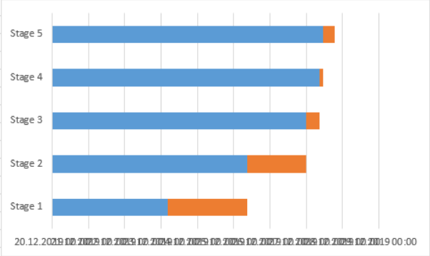
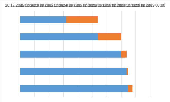
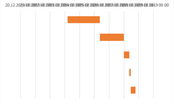
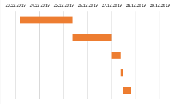
NOTE: if all go well, I will have this:
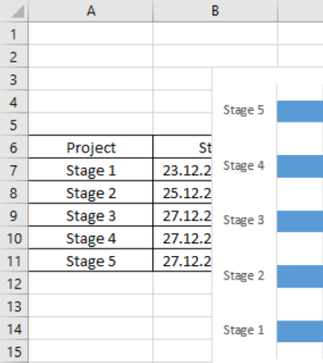
- iii. In the chart, remove the comment section
- i. In the chart, select the blue bars then right click to select “shape fill”
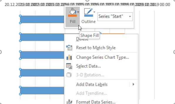
1. Select “no fill”
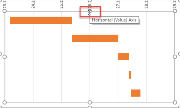
- i. In the chart, select the date section then right click to select “format axis”
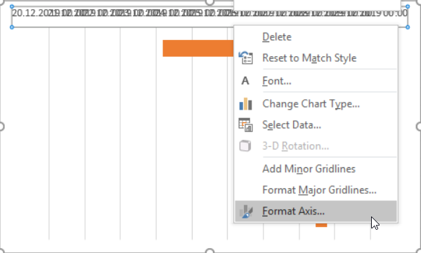
1. Put this number in the “minimum” field
NOTE: 23.12.2019 = 43822, to know the correct decimal number corresponding to a date, in an empty cell, put the date and format it as “number”
2. In the “major” field, make sure to have 1
NOTE: to display 1 day per column
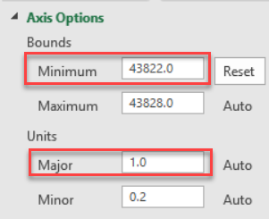
3. Scroll down, in the “number -> category”, select “date”
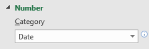
NOTE: to show only the date if not, it will show the date + hour and if all go well, I have this:
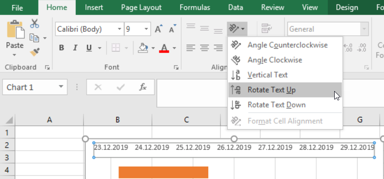
- iii. Select back the date section
1. Click “orientation -> rotate text up”
- iv. Making all fit
1. Click anywhere in the “pivot area”
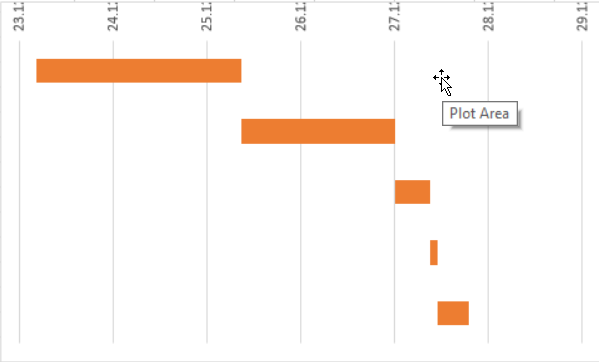
2. Move the mouse until the middle of the button
3. Move the button down until to show the full date
- i. In the chart, select the comment section then right click to select “format axis”
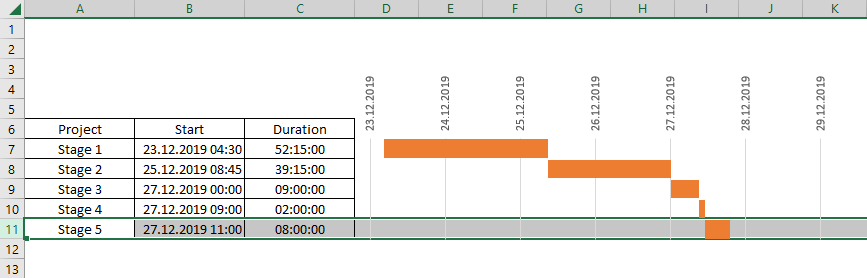
Now that I have my chart, the next step is to align it with my table, so here, it is up to me, I can put bigger the row for the table, make bigger the chart, etc. To make bigger the bars of the chart:
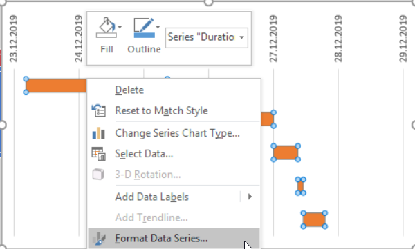
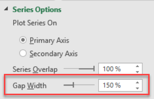
- 1. Right click on the bar then select “format data series”
- 2.In “gap width”:
a. Reduce the percentage to make bigger
b. Increase the percentage to make thinner
What I like to do, it is to put the full sheet with the blank colour and make the chart transparent without outline so when I select the row of the stage 5, for instance, it will highlight the full picture.
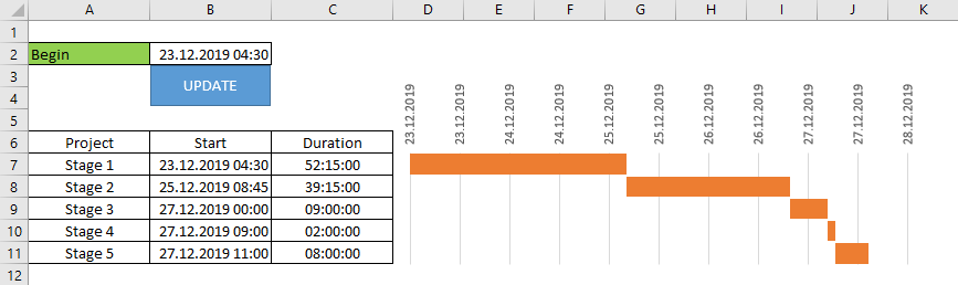
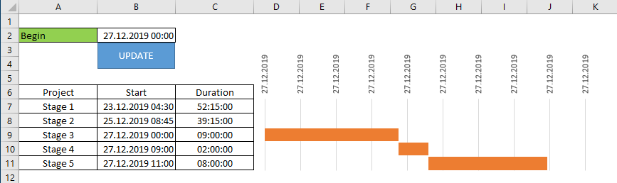
Other thing I like to do, it is to put a begin date in a cell and each time I change the start date, by clicking on the update, the chart will update the stages. For that, I have to create a macro and save the file as xlsm. If you are interested, below the VBA code:
Sub test()
' change xxx by the chart name and change B2 by the date cell
With ActiveSheet.ChartObjects("xxx").Chart.Axes(xlValue)
On Error Resume Next
.MinimumScale = Range("B2").Value
End With
End Sub
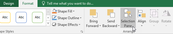
To know the name of your chart, select your chart and go to “format -> selection pane”.
Interesting Management
-

Part 1: A good manager, better team motivation, better team productivity, better team results
When you are managing a team, “how to be a good manager” is the “must”...
-

Report optimization, increase your time management
As manager, I am doing many reports, even when I was an ITIL consultant, I still needed to do many reports...
-

Tools to get your ITIL intermediate certifications, the missing 15 points for the ITIL 4 Managing Professional
ITIL V3 is going to be obsolete...
-

The importance of the first customer meeting for the service
Managing an IT service when I start a new company is not an easy task, particularly true, if the service...
-

1 click macro tool: Incident/Problem Management - create a daily report in excel
This file will allow you to have in one single excel file the issues (incidents, problems, outages, major incidents...
-
1 click macro tool: Incident/Problem Management - create a daily report and a public version in excel
This file is an extended version of the above that includes the option to create a public version to share with...
-
1 click macro tool: Problem/Incident Management - compile multiple daily excel files in 1 with access
This file will allow you to compile all daily issues reported in excel in 1 single excel file in xlsx format...
-
1 click macro tool: Incident/Problem Management - create a monthly report in excel
This file will allow you to create a monthly report related to daily issues and updating all pivots, charts and...
-
1 click macro tool: Problem/Incident Management - create daily reports and compile them in 1 to create the monthly report in excel
This tool will create daily reports then compile them to create the monthly...
-

Calculate a weighted average for a SLA and a conversation time with a formula in an excel report
In one of my experiences, I had a tool that gave me the weighted average...
-
Search in different sheets then display the wanted data with a formula in an excel report
vlookup and hlookup are formulas that allow to search a data in another...
-
Find the good data by matching 3 different criterias with a formula in an excel report
It is a combination of “index” and “match” formulas, much better...
-
Sum and count sales with a formula in an excel report
Extracting data from salesforce or qlikview may not give the information I needed, it already happened...
-
Know how long a service is impacted with a formula in an excel report
It is important to know how long the service has been impacted by...