

Power BI: format chart column color of single data
I will explain here how to customize the color of a specific column in the x-axis if you have only 1 single data, something like that:
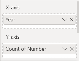
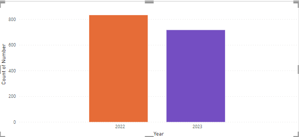
I have this simple chart:
 |
 |
The first thing to do is to create a new column with this formula:
- Option 1 if a year column exists: IF(CONVERT([argument],INTEGER)=YEAR(NOW()),1,0)

- Option 2 if not exists: IF(CONVERT(FORMAT([argument],"YYYY"),INTEGER)=YEAR(NOW()),1,0)

NOTE:
- Replace “argument” by yours
- I can replace YEAR(NOW()) by 2023 for instance but I prefer this way so for a new year, I won’t have to change it
- If I have more than 2 years, change “1” by another number and add another formula by replacing “0”, for instance if I have 2021, 2022 and 2023:
IF(CONVERT([argument],INTEGER)=YEAR(NOW()),2,IF(CONVERT([argument],INTEGER)=YEAR(NOW())-1,1,0))
So 2023 = 2, 2022 = 1 and 2021 = 0.
In both formulas, I define 2023 = 1 and 2022 = 0 and I use the CONVERT function to change the “year” from text into a whole number (to know the options, refer to Microsoft webpage).
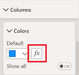
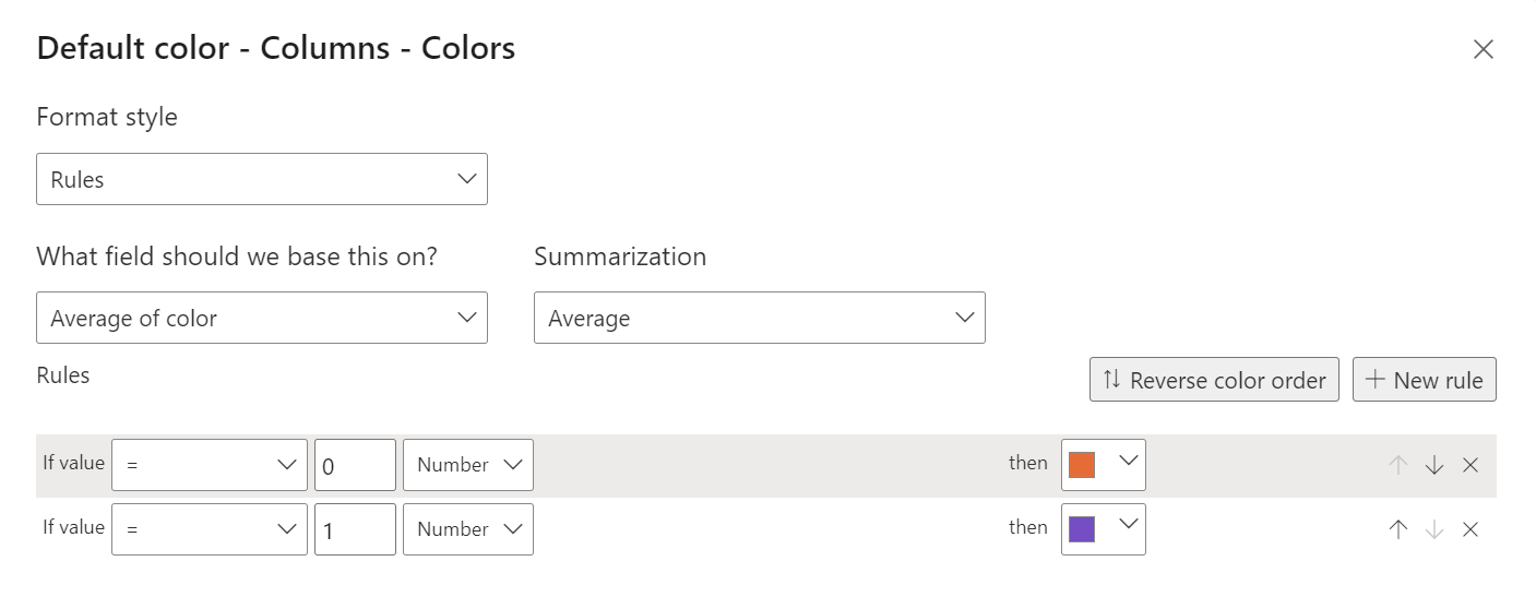
Once done, I will click on the conditional formatting “fx” and fill:
- Format style -> rules
- What field should we base this on ? -> select the new column
- Summarization -> select “minimum”, “maximum” or “average”
- Rules -> as shown in the picture (to create a new one, just click on “+ new rule”)
NOTE: “minimum” and “maximum” are best option if I have only 2 years
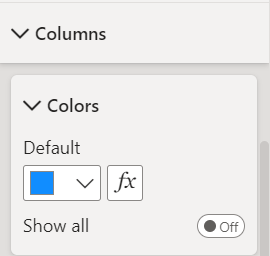
The result:
Interesting Management
-

Part 1: A good manager, better team motivation, better team productivity, better team results
When you are managing a team, “how to be a good manager” is the “must”...
-

Report optimization, increase your time management
As manager, I am doing many reports, even when I was an ITIL consultant, I still needed to do many reports...
-

Tools to get your ITIL intermediate certifications, the missing 15 points for the ITIL 4 Managing Professional
ITIL V3 is going to be obsolete...
-

The importance of the first customer meeting for the service
Managing an IT service when I start a new company is not an easy task, particularly true, if the service...
-

1 click macro tool: Incident/Problem Management - create a daily report in excel
This file will allow you to have in one single excel file the issues (incidents, problems, outages, major incidents...
-
1 click macro tool: Incident/Problem Management - create a daily report and a public version in excel
This file is an extended version of the above that includes the option to create a public version to share with...
-
1 click macro tool: Problem/Incident Management - compile multiple daily excel files in 1 with access
This file will allow you to compile all daily issues reported in excel in 1 single excel file in xlsx format...
-
1 click macro tool: Incident/Problem Management - create a monthly report in excel
This file will allow you to create a monthly report related to daily issues and updating all pivots, charts and...
-
1 click macro tool: Problem/Incident Management - create daily reports and compile them in 1 to create the monthly report in excel
This tool will create daily reports then compile them to create the monthly...
-

Calculate a weighted average for a SLA and a conversation time with a formula in an excel report
In one of my experiences, I had a tool that gave me the weighted average...
-
Search in different sheets then display the wanted data with a formula in an excel report
vlookup and hlookup are formulas that allow to search a data in another...
-
Find the good data by matching 3 different criterias with a formula in an excel report
It is a combination of “index” and “match” formulas, much better...
-
Sum and count sales with a formula in an excel report
Extracting data from salesforce or qlikview may not give the information I needed, it already happened...
-
Know how long a service is impacted with a formula in an excel report
It is important to know how long the service has been impacted by...