

Power BI: hide visual and change background color based on selection
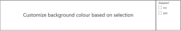
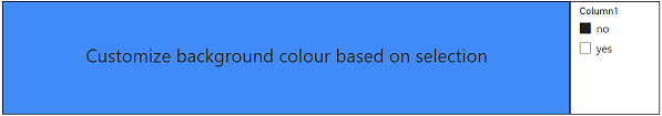
Some small tricks to customize the background colour of a text box, a card, a chart, visual, etc. or to hide them based on the selection that I will do with a slicer. Let’s start first by personalizing the background, I have this text box with this slicer:
First I have to create a measure and there are 2 options, using IF or SWITCH. For both, I have to combine with SELECTEDVALUE, ISFILTERED, etc.
- My formula with IF:
IF(SELECTEDVALUE('Table'[argument])="yes","colorcode1",IF(SELECTEDVALUE('Table'[column1])=
"no","colorcode2","#FFFFFF"))

- My formula with SWITCH:
SWITCH(TRUE(),SELECTEDVALUE('Table'[argument])="yes","colorcode1",SELECTEDVALUE('Table'[argument])=
"no","colorcode2","#FFFFFF")

NOTE: change “table”, “argument”, “colorcode1” and “colorcode2” by yours. Now I will have to link them all together:
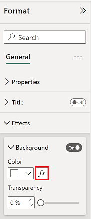
- Select the text box
- In “format -> effects -> background”, click on the “fx” button
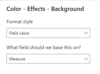
- In the “format style”, select “field value” and the one below, select my measure
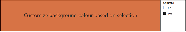
So if there is no selection, the background will be blank (#FFFFFF), if “yes” is selected, it will change to orange (#E66C37) and if it is “no”, blue (#118DFF).
NOTE: if I want the background to be transparent, just add 00 at the end of the code colour, for instance: #FFFFFF00.
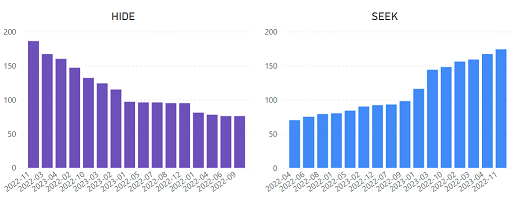
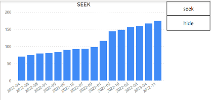
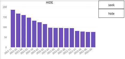
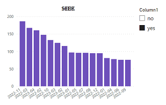
To make disappear visuals (table, pie, slicer, etc.), there are 2 options, one taking a screenshot focused for offline data and the other one, more focused for live data. Anyway, based on what you need, use whatever you want. I have those 2 charts, one is called “hide” and the other “seek”:
The first option is better for data not updated many times because it will take a snapshot of the current situation (take note that slicers/filters can’t be used, buttons or shapes should be created/configured to act like slicers/filters):
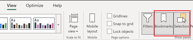
- Click on “view” then “bookmarks” and “selection”
- In “bookmarks”, click on “add” 3 times to create 3 bookmarks (if need be, change the name)
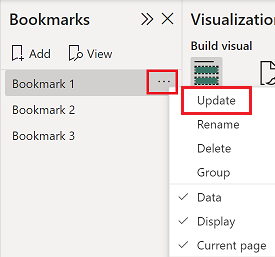
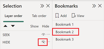
- Select “bookmark 1” and in “selection”, I will hide any numbers of things I want, in my example, I just have one called “seek”
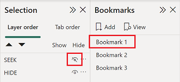
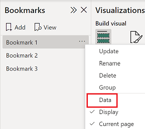
- Click on the 3 dots then “update”. If slicers/filters will be hidden, unstick “data” if you don’t want selections to be reseted
 |
 |
- Repeat the same actions for “bookmark 2” but I will hide the ones I didn´t with “bookmark 1”, in my example, it is just “hide”
- For “bookmark 3”, I will do nothing
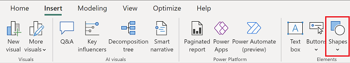
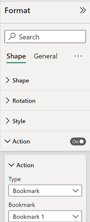
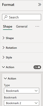
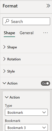
- Click on “insert -> shapes” to create 3 rectangles or whatever you want (if you prefer, you can use “insert -> buttons -> blank”). I will change the color to match my background and one I will put “seek”, the other “hide” and the last one “clear"
- Select the “hide” shape and click on “format -> shape -> action” and fill the fields as in the picture and do the same with “seek” and “clear” shapes
| hide | seek | clear |
 |
 |
 |
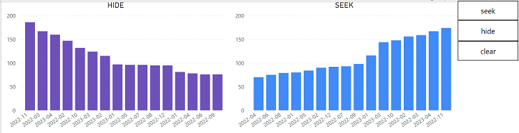
If I “CTRL + click” on the:
- “seek” shape, “hide” will disappear
- “hide” shape, “hide” will appear but “seek” will disappear
- “clear” shape, “hide” and “seek” will appear
NOTE: once published, the “CTRL + click” will be changed on “click” only.
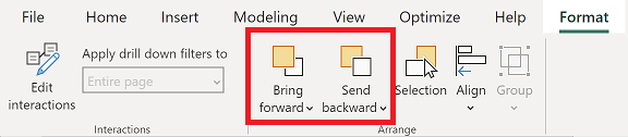
If I want to combine both charts so making my audience believe that there is only 1 chart instead of 2. I will put one above the other (if need be use “bring forward” or “send backward” options under “format”)
And I will not create “bookmark 3”:
 |
 |
The second option is better for data in real time using a direct connection to be updated every second. I will take the same charts and I will use the same slicer (the one I use to personalize the background). The goal is to combine them together so to make the audience thinks that there is only 1 chart. 2 measures have to be created:
- Measure1 to hide “hide” with this formula:
IF(SELECTEDVALUE('table'[argument])="value",IF(SELECTEDVALUE('table'[argument])="value",0,1),1)

- Measure2 to make invisible the background “seek” with this formula:
IF(SELECTEDVALUE('table'[argument])="value","#FFFFFF00")

NOTE:
- Change “table”, “argument” and “value” by yours
- Not possible to use the same 'table'[argument] for the slicer and filters + chart so it should be either:
- Slicer 'table-1'[argument-1] -> filters + chart 'table-1'[argument-another]
- Or slicer 'table-1'[argument-1] -> filters + chart 'table-another'[argument-1]
Let’s do magic:
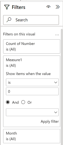
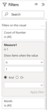
- Select “hide” and put the measure1 in the filters, fill the field like in the “hide” picture. Once I will click on “apply filter”, “hide” will disappear. Select “seek” and configure the measure1 like in the “seek” picture
| HIDE | SEEK | |
 |
 |
 |
- Still with “seek”, I will change its background using the measure2 (follow the process explains above)
- Put one above the other so to form only 1
If I select nothing, “seek” can be seen. Same thing if “no” is selected but if I select “yes”, “hide” appears and “seek” disappears.
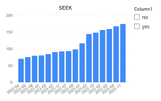 |
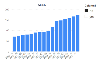 |
 |
When “hide” appears (right picture), its title is mixed with the “seek” one, to make it disappear, go to “title” and do the same thing as for the background. If not, put the same title for both or just be creative !!!
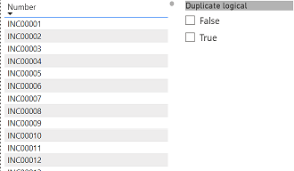
What happens if my filter is a logical type ? For instance:
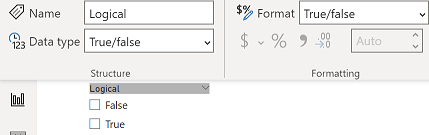
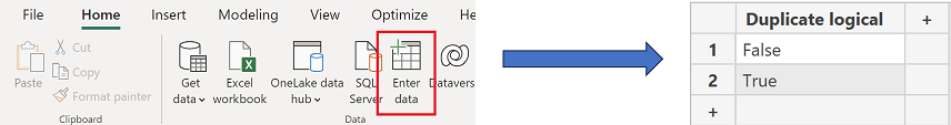
The rules are not the same, to make it work, first, I will have to create a new table duplicating it because using the original one, it will not work:
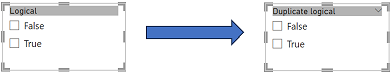
Replace the filter by this new one and don´t forget to create a relationship:
Once done, I will create my 2 formula:
- Hide formula: IF(NOT(ISFILTERED('table'[argument])),0,IF(SELECTEDVALUE('table'[argument])=TRUE,0,
IF(SELECTEDVALUE('table'[argument])=FALSE,1)))
- Invisible background: IF(NOT(ISFILTERED('table'[argument])),"#FFFFFF00",IF(SELECTEDVALUE('table'[argument])=
TRUE,"#FFFFFF00","#FFFFFF"))
I have those 2 tables that I will combine into 1, my goal is to make appear the color one only if I will select "false":
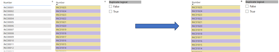
So:
- For the grey one, the “measure 1” will be 0
- For the color one, the “measure 1” will be 1 and for its background, I will put the “measure 2”
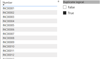
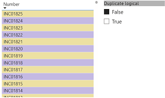
The result is if I don´t select nothing, grey one will show, same thing if I select "true" but selecting "false", the color one popups:
 |
 |
 |
Interesting Management
-

Part 1: A good manager, better team motivation, better team productivity, better team results
When you are managing a team, “how to be a good manager” is the “must”...
-

Report optimization, increase your time management
As manager, I am doing many reports, even when I was an ITIL consultant, I still needed to do many reports...
-

Tools to get your ITIL intermediate certifications, the missing 15 points for the ITIL 4 Managing Professional
ITIL V3 is going to be obsolete...
-

The importance of the first customer meeting for the service
Managing an IT service when I start a new company is not an easy task, particularly true, if the service...
-

1 click macro tool: Incident/Problem Management - create a daily report in excel
This file will allow you to have in one single excel file the issues (incidents, problems, outages, major incidents...
-
1 click macro tool: Incident/Problem Management - create a daily report and a public version in excel
This file is an extended version of the above that includes the option to create a public version to share with...
-
1 click macro tool: Problem/Incident Management - compile multiple daily excel files in 1 with access
This file will allow you to compile all daily issues reported in excel in 1 single excel file in xlsx format...
-
1 click macro tool: Incident/Problem Management - create a monthly report in excel
This file will allow you to create a monthly report related to daily issues and updating all pivots, charts and...
-
1 click macro tool: Problem/Incident Management - create daily reports and compile them in 1 to create the monthly report in excel
This tool will create daily reports then compile them to create the monthly...
-

Calculate a weighted average for a SLA and a conversation time with a formula in an excel report
In one of my experiences, I had a tool that gave me the weighted average...
-
Search in different sheets then display the wanted data with a formula in an excel report
vlookup and hlookup are formulas that allow to search a data in another...
-
Find the good data by matching 3 different criterias with a formula in an excel report
It is a combination of “index” and “match” formulas, much better...
-
Sum and count sales with a formula in an excel report
Extracting data from salesforce or qlikview may not give the information I needed, it already happened...
-
Know how long a service is impacted with a formula in an excel report
It is important to know how long the service has been impacted by...