

Power BI: interaction between charts (filtering between each others)
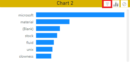
This article is to explain how 2 charts like bar charts can filter between them. For instance, by selectin an option in the chart 1, the chart 2 will only display related results:
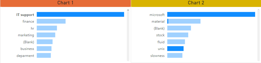 |
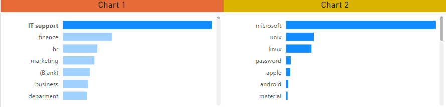 |
There are 2 ways to do it, via the Power Bi Desktop or the Power BI Service by using the “edit interaction” option. For Power BI Desktop:
- 1. Select the chart 1
- 2. Click on format -> edit interactions
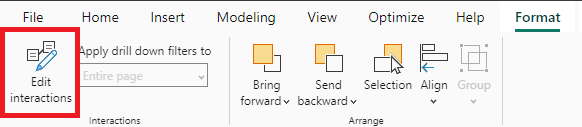
- 3. In the chart 2, at the top right, select “filter”
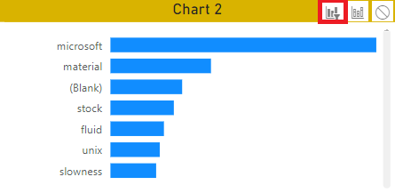
If I want the chart 1 to behave the same way as the chart 2, I will select the chart 2 and on the chart 1, select “filter”. Once done, just save, publish and update the app so the audience can play with it.
For Power BI Service, it is the same thing except that to find the “edit interactions” option:
- 1. Open the report
- 2. Click on “edit”

- 3. Click on “visual interactions” -> turn on “edit interactions”

- 4. Select the chart 1 and on the chart 2, select “filter”
Once done, save and update the app.
Interesting Management
-

Part 1: A good manager, better team motivation, better team productivity, better team results
When you are managing a team, “how to be a good manager” is the “must”...
-

Report optimization, increase your time management
As manager, I am doing many reports, even when I was an ITIL consultant, I still needed to do many reports...
-

Tools to get your ITIL intermediate certifications, the missing 15 points for the ITIL 4 Managing Professional
ITIL V3 is going to be obsolete...
-

The importance of the first customer meeting for the service
Managing an IT service when I start a new company is not an easy task, particularly true, if the service...
-

1 click macro tool: Incident/Problem Management - create a daily report in excel
This file will allow you to have in one single excel file the issues (incidents, problems, outages, major incidents...
-
1 click macro tool: Incident/Problem Management - create a daily report and a public version in excel
This file is an extended version of the above that includes the option to create a public version to share with...
-
1 click macro tool: Problem/Incident Management - compile multiple daily excel files in 1 with access
This file will allow you to compile all daily issues reported in excel in 1 single excel file in xlsx format...
-
1 click macro tool: Incident/Problem Management - create a monthly report in excel
This file will allow you to create a monthly report related to daily issues and updating all pivots, charts and...
-
1 click macro tool: Problem/Incident Management - create daily reports and compile them in 1 to create the monthly report in excel
This tool will create daily reports then compile them to create the monthly...
-

Calculate a weighted average for a SLA and a conversation time with a formula in an excel report
In one of my experiences, I had a tool that gave me the weighted average...
-
Search in different sheets then display the wanted data with a formula in an excel report
vlookup and hlookup are formulas that allow to search a data in another...
-
Find the good data by matching 3 different criterias with a formula in an excel report
It is a combination of “index” and “match” formulas, much better...
-
Sum and count sales with a formula in an excel report
Extracting data from salesforce or qlikview may not give the information I needed, it already happened...
-
Know how long a service is impacted with a formula in an excel report
It is important to know how long the service has been impacted by...