

Power BI: create comparison chart with 1 single table
In IT, I use to have the created and closed columns in one single table:
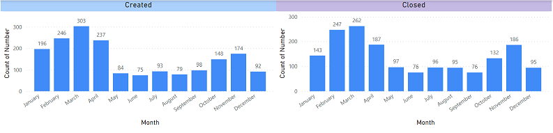
And most of the time, I need to compare them so I can create 2 charts like that and see the difference:
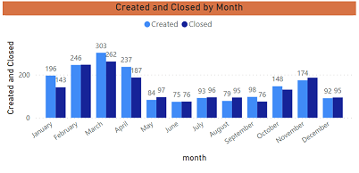
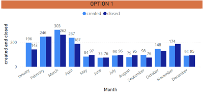
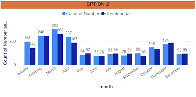
But to save spaces and for a better view, I like to combine both data into 1 single chart:
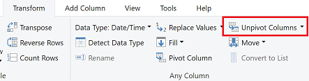
There are 2 options to get this result, the first one is to unpivot both columns. Take note that doing that, charts that you have created will be “lost” because unpivoting them will rename your columns.
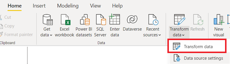
- Go to the query editor by clicking on “transform data -> transform data”
- Select both columns (created and closed)
- Click on “transform -> unpivot columns”
- Once done, exit the editor by clicking on “home -> close & apply”
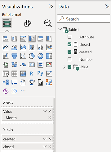
You will see that both columns have been renamed:
- The attribute column showing “created” and “closed”
- The value column showing the date
You can change the name of the columns if you want but for my article, I won´t. I will create 2 measures with those formula:
- One for created -> CALCULATE(COUNT('table'[argument1]),'table'[argument2] ="created")

- One for closed -> CALCULATE(COUNT('table'[argument1]),'table'[argument2] ="closed")

NOTE: change “table” and “argument” by yours. Once it is done, I just have to create my chart:
 |
 |
For the second option, contrary to the first one, you won´t loose any of your charts.
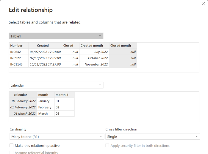
- Group “created” and “closed” by month
- Select the “created” column
- Click on “data groups -> new data groups”
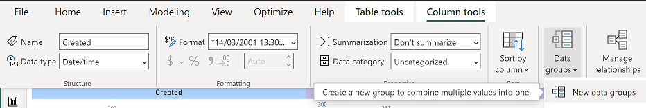
- Change the name (if you want, here I put “created month”) and in the “bin size” field, put like in the picture
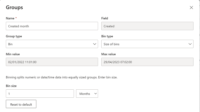
- Do the same thing for the “closed” column
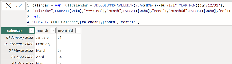
- Create a calendar table (for more information, read my other article Power BI: create an automatically updated calendar)
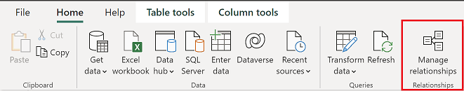
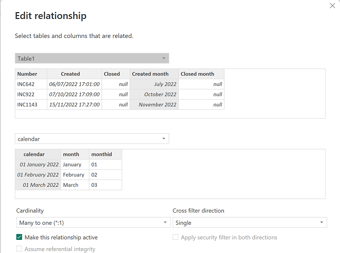
- Create a relationship between this calendar table and both new columns (“created month” and “closed month”) by clicking on “home -> manage relationships” then “new”
 |
 |
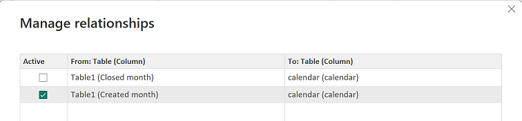
- Create a measure to count number of closed with this formula: CALCULATE(COUNTROWS('table1'),USERELATIONSHIP('table1'[argument1],'table2'[argument1]))

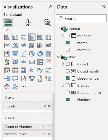
NOTE: you can use other functions than COUNTROWS, the most important is the USERELATIONSHIP (change “table” and “argument” by yours). Once it is done, I just have to create my chart:
 |
 |
Interesting Management
-

Part 1: A good manager, better team motivation, better team productivity, better team results
When you are managing a team, “how to be a good manager” is the “must”...
-

Report optimization, increase your time management
As manager, I am doing many reports, even when I was an ITIL consultant, I still needed to do many reports...
-

Tools to get your ITIL intermediate certifications, the missing 15 points for the ITIL 4 Managing Professional
ITIL V3 is going to be obsolete...
-

The importance of the first customer meeting for the service
Managing an IT service when I start a new company is not an easy task, particularly true, if the service...
-

1 click macro tool: Incident/Problem Management - create a daily report in excel
This file will allow you to have in one single excel file the issues (incidents, problems, outages, major incidents...
-
1 click macro tool: Incident/Problem Management - create a daily report and a public version in excel
This file is an extended version of the above that includes the option to create a public version to share with...
-
1 click macro tool: Problem/Incident Management - compile multiple daily excel files in 1 with access
This file will allow you to compile all daily issues reported in excel in 1 single excel file in xlsx format...
-
1 click macro tool: Incident/Problem Management - create a monthly report in excel
This file will allow you to create a monthly report related to daily issues and updating all pivots, charts and...
-
1 click macro tool: Problem/Incident Management - create daily reports and compile them in 1 to create the monthly report in excel
This tool will create daily reports then compile them to create the monthly...
-

Calculate a weighted average for a SLA and a conversation time with a formula in an excel report
In one of my experiences, I had a tool that gave me the weighted average...
-
Search in different sheets then display the wanted data with a formula in an excel report
vlookup and hlookup are formulas that allow to search a data in another...
-
Find the good data by matching 3 different criterias with a formula in an excel report
It is a combination of “index” and “match” formulas, much better...
-
Sum and count sales with a formula in an excel report
Extracting data from salesforce or qlikview may not give the information I needed, it already happened...
-
Know how long a service is impacted with a formula in an excel report
It is important to know how long the service has been impacted by...